Password required
This case study isn’t yet publicly available due to confidentiality agreements. Email me here to request access.
Rebuilding an AI Chatbot
A chatbot rebuilt for guided, playful learning
AcquiLingua is an AI language learning chatbot that teaches you through conversation rather than lessons. I redesigned the interface to be a modern, playful, and guided experience.
My Role
- 01Built the chatbot interface into a guided, progress-oriented experience using Figma and Codex
- 02Conducted 7 user tests and synthesized findings to pinpoint interface friction points with the old design
- 03Audited 4 competitor AI chatbot and language learning apps to see how they handle onboarding and gamification
- 04Collaborated closely with engineering and business stakeholders to balance their priorities with user needs
🔨Rebuilt
Reworked the chatbot's core screens in Figma and Codex
👩🏻💻7 user tests
Conducted to find where learners got stuck or lost motivation
👾Gamified
Built a gamified progress-oriented experience
Users struggled to navigate both the interface and the experience
The biggest issue users had was the lack of guidance from the moment they opened the chatbot. It didn’t feel built for beginners, and a lot of the features were too technical for them to understand.
❓ Core interactions were complicated to users
No guidance when starting a lesson, users didn’t know what half the buttons did.
⭐ Modernize and simplify the UX without losing the emoji niche
Wanted better UX without losing the emoji niche, plus new flashcards to mix up practice.
How might we create a personalized language-learning experience that helps learners practice confidently and see their progress over time?
A simplified and guided AI chatbot experience
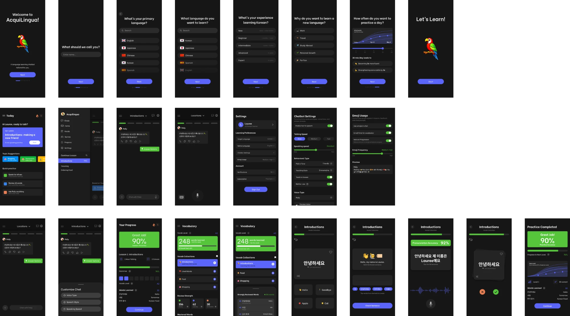
AcquiLingua’s AI tutor holds adaptive conversations calibrated to your level. I rebuilt the interface around it, adding guided lesson paths, inline correction feedback, and interactivity to make practice more engaging.
Guided from the first message
The home screen leads you straight into a lesson, and Polly sends the first message to help
See what changed
Togglable grammar corrections show original text and a guided message at the bottom for tips and the right sentence structure
Flashcards with emojis
Users can use flashcards to study vocabulary and has emojis integrated for an association game
Build it, don’t just read it
Input sentence building to help users improve grammar before heading into the next lesson
Testing with users, then auditing the competition
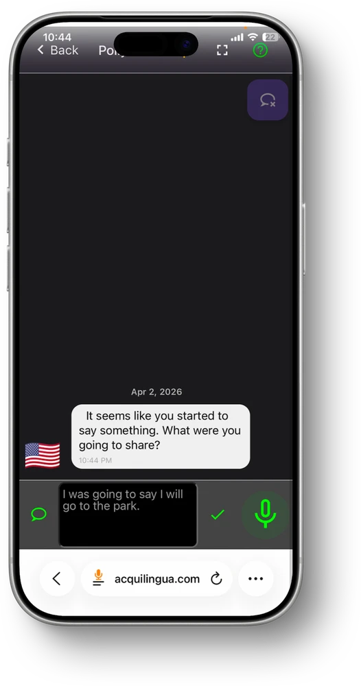
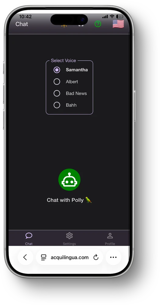
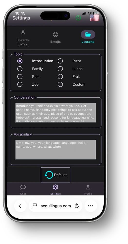
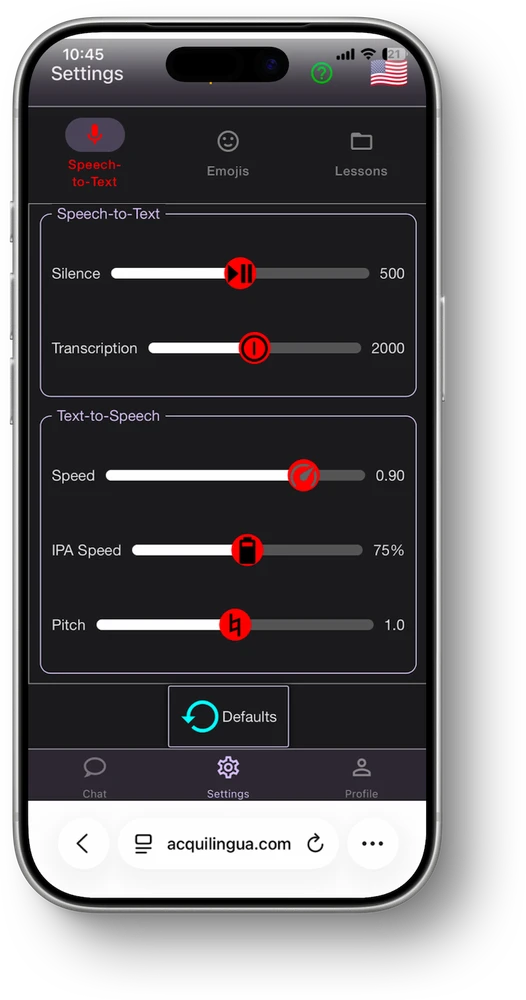
I ran user tests on the existing interface to find where people got stuck and noted key issues. I then audited top AI language and chatbot apps like ChatGPT, Claude, Pingo AI, and Praktika for inspiration on onboarding, training, and gamification patterns.
What users told me
I ran 7 user tests on the existing interface to see where people actually got stuck. Testers struggled to tell whether the AI had corrected their message, weren’t sure what the buttons on the main chat screen did, and found the visual design dated compared to other language-learning apps they’d used.
“When it revised my message, I couldn’t even see my original message so I don’t know what I did wrong.”
“I think it could look more modern. This is confusing as to how this would be better than any other language learning chatbot.”
“A little antiquated, not a modern website even though there are aspects that are. The landing page doesn’t look good and the globe isn’t obvious to me that this is where I choose a language.”
“Put the settings in the main nav bar so we don’t have to go back. I wish there were suggested questions the chatbot asks. I didn’t expect it to correct my grammar, and it’s a little offensive.”
Observing AI chatbots to see what works
What the research told us
Pulling the user tests and competitor audit together, three things stood out:
- 01Corrections need to show before and after. P1 and P4 wanted to know what changed and why. Pingo AI has quick replies like “Can you explain what you just said?” built right into the chat.
- 02Old interface read as dated. P2 and P3 both shared this pain point. Claude and Praktika fix this with tone and personality through their design and a minimal, intuitive interface.
- 03Nothing was discoverable. P3 missed the language picker icon, and P4 wanted settings up front and starter prompts. Every competitor, like Pingo AI and ChatGPT, walks you through setup before dropping you into the chat.
Familiar patterns could lower the learning curve.
- Looked at direct competitors and top market leaders for AI chatbots to reference their best features and user flows.
- Users described the interface as dated and struggled to understand unfamiliar controls.
- Claude and Praktika showed how restrained visual systems, recognizable chat patterns, and stronger hierarchy could reduce how much users needed to learn before starting a lesson.
Building a working prototype, not just screens
I designed the first iterations in Figma. Once I got the green light, I used Figma Make to turn them into code and moved the project into Codex to keep building. Static screens can’t show how a chat should actually behave, so I wanted something people could click through.
Where it Started
With two weeks remaining before beta, I compressed exploration into rapid high-fidelity iterations rather than producing separate low-fidelity deliverables. This gave the founders something concrete to evaluate while creating a foundation I could immediately prototype in code.
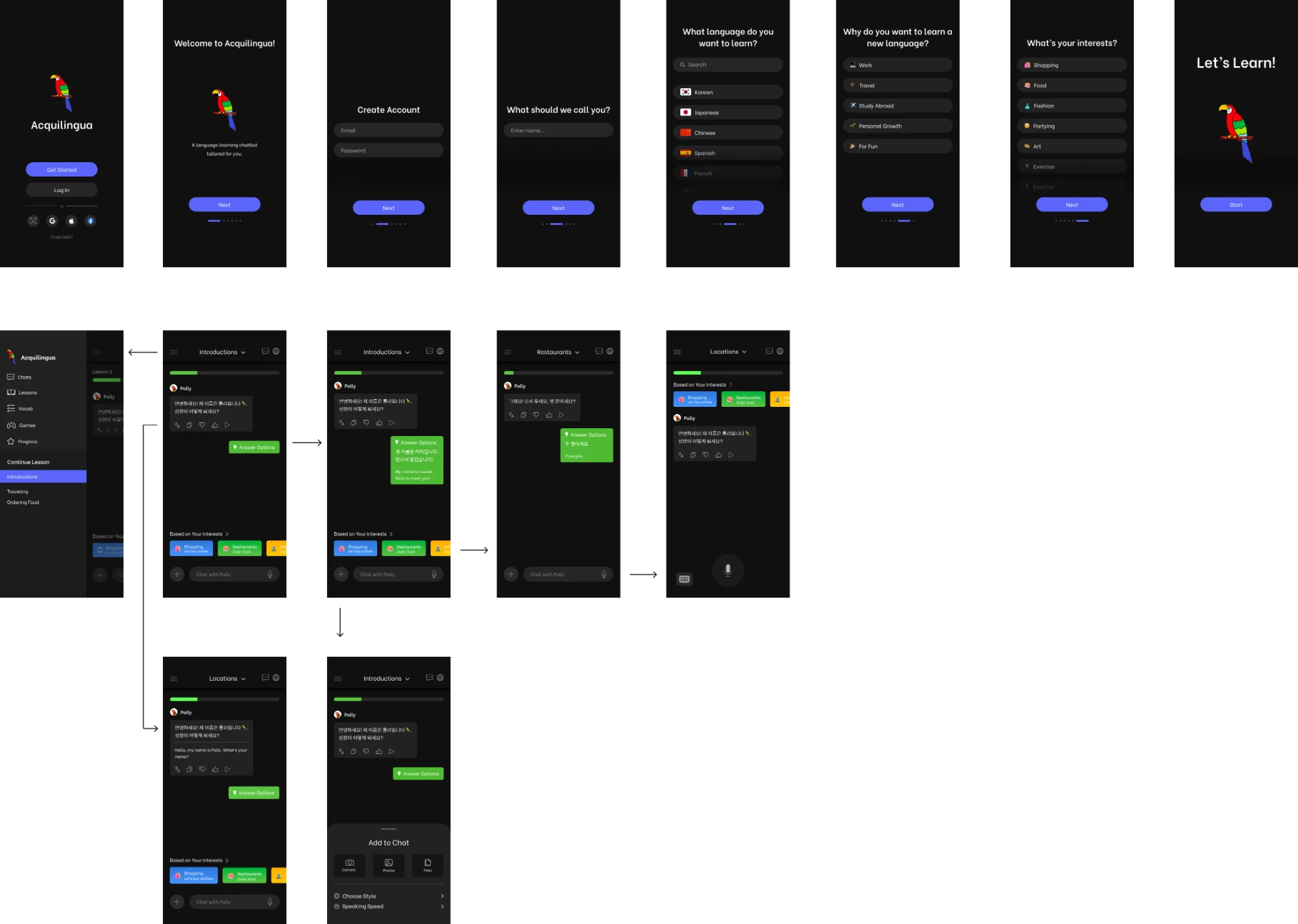
I converted the design through Figma Make, then took that code into Codex and kept iterating there. The result was a working mobile version of the chatbot with every page and interaction built out.
Final Design
The interface is a simplified AI language learning chatbot with dual language chat abilities, flashcards, and speech practices that engage the user with various learning techniques. I drew inspiration from popular chatbots to create familiarity in the product, but added twists tailored to the language learning experience.
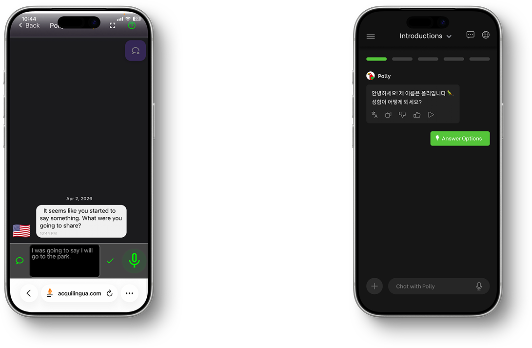 Before
After
Before
After
Note to self: set rules first
This was my first time building a live product tied to my own design, and it was really rewarding to see it come to life. I worked closely with the co-founders and learned how to balance what they wanted with what users actually needed from a language learning chatbot.
My first real prototype built with code
The first time I built a usable prototype through AI tools myself, not just handed off to engineers after design.
Guardrails through documentation
Created a design system guideline to give Codex clear rules once inconsistent type and spacing kept creeping in.
Start the doc sooner
Writing that guardrail doc earlier, before problems piled up, is the biggest process change I’d make next time.